
Easy to manage filter facets
Clear which facets are currently applied
Clear which sites the filter applies to
Scales with hundreds of sites
Use the design system as much as possible
Content editors
Business managers
Web developers
Lead/solo designer
Previous designer
Product owner
Product manager
In this project, filter values determine which content is selected, and "assigned sites" refers to which sites will receive this content.
Click images to enlarge.
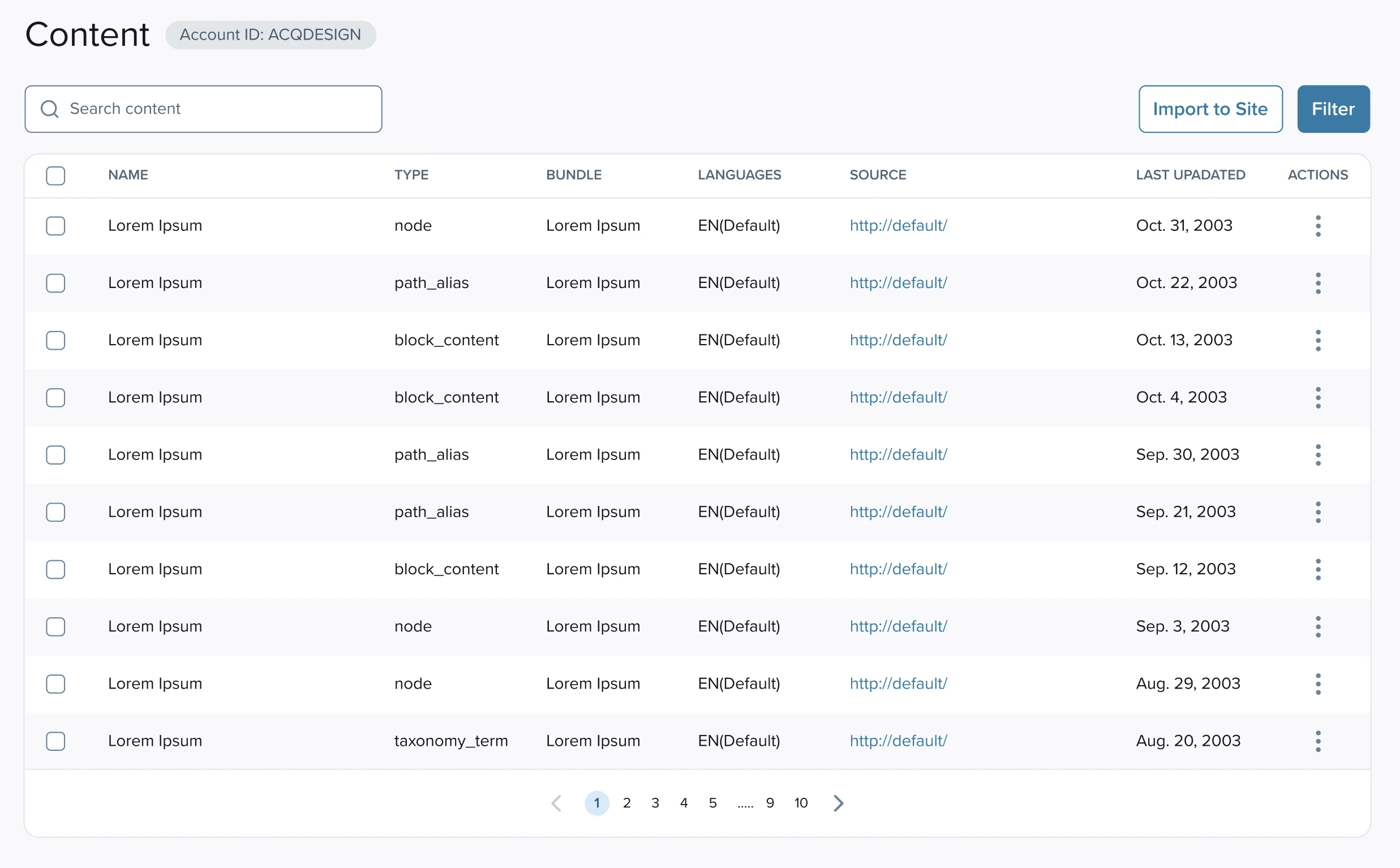
Default view
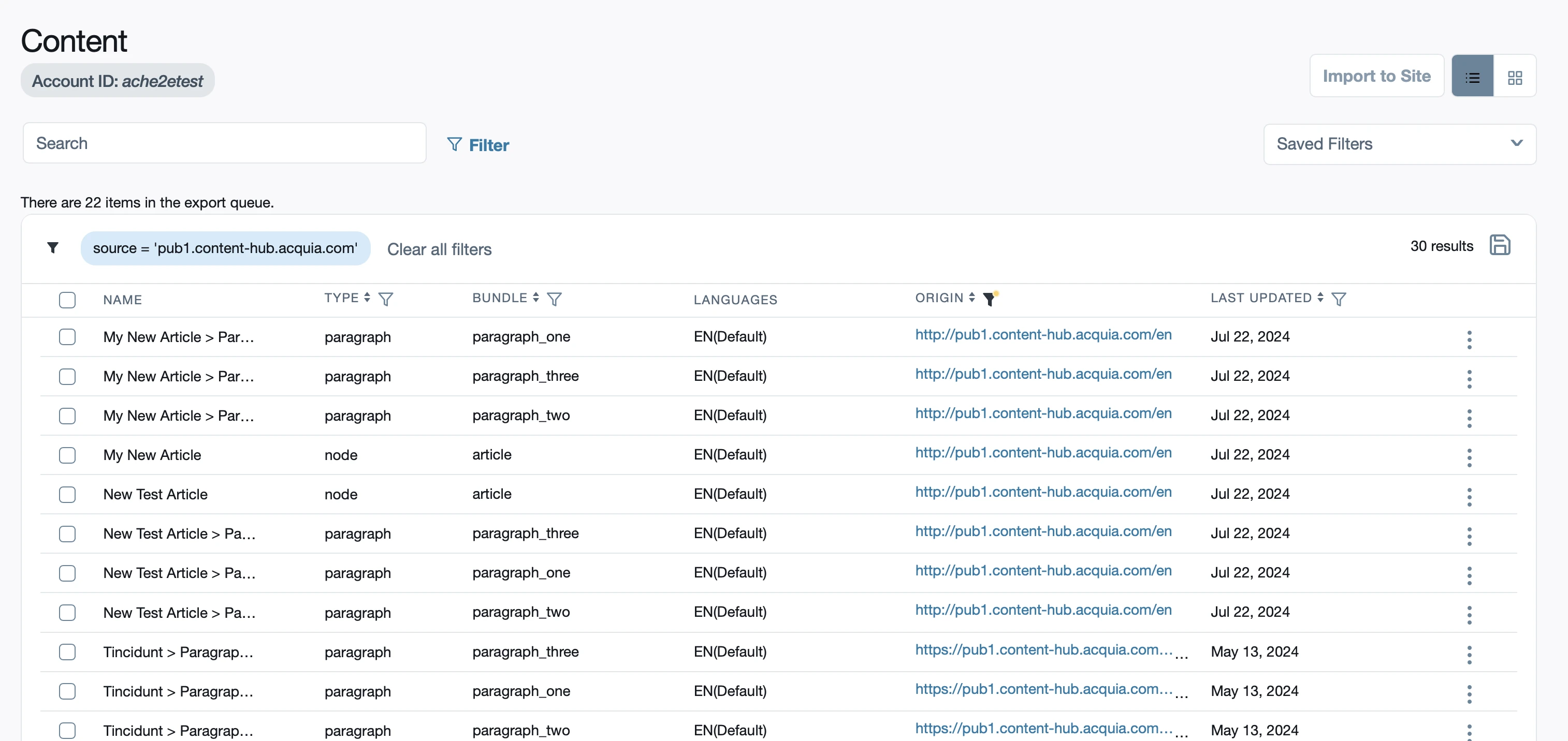
Selecting filter values

Editing assigned sites in sidebar
I started with partial designs from a designer previously on the team and continued iterating to achieve:
better consistency within our systems
better consistency with other products
simplify the users' mental model
Since this was a redesign of an existing feature, it was important to balance the improvements with keeping certain terminology and frameworks in place so as not to frustrate current users.
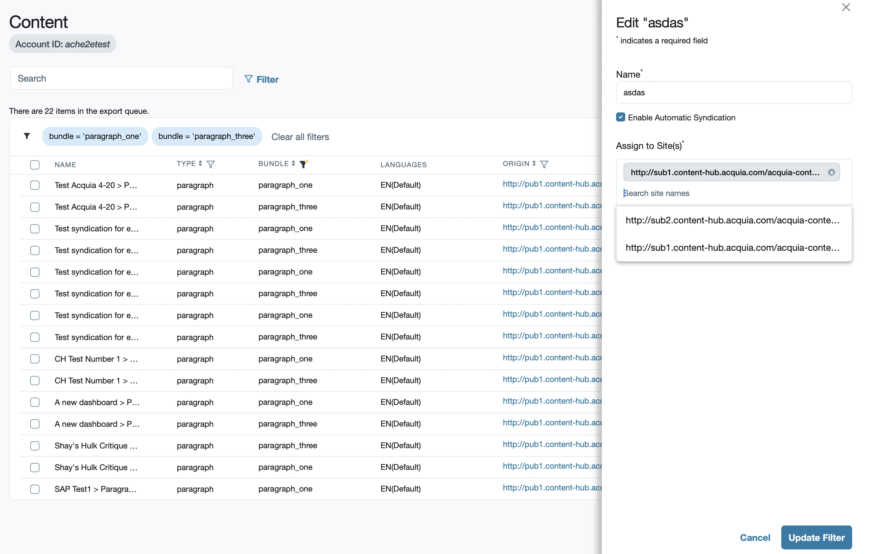
Click images to enlarge.
Default view
Filter values selection
Editing filter name and assigned sites
Can users easily find and open filter settings?
Do users understand how to preview and save filters?
Can users easily edit assigned sites in a filter?
To answer these questions, I drafted a script for testing and reviewed it with our UX researcher and product manager.
Reviewed and synthesized data from testing
Highlighted key insights and summarized the key points
Grouped into categories of navigation, saving, and other

An example of the summarized key points for navigation together with some accompanying tester highlights.
Examples of changes made after testing:
Reviewed final designs with Product
Created detailed documentation for engineers
Shared final designs with engineering team
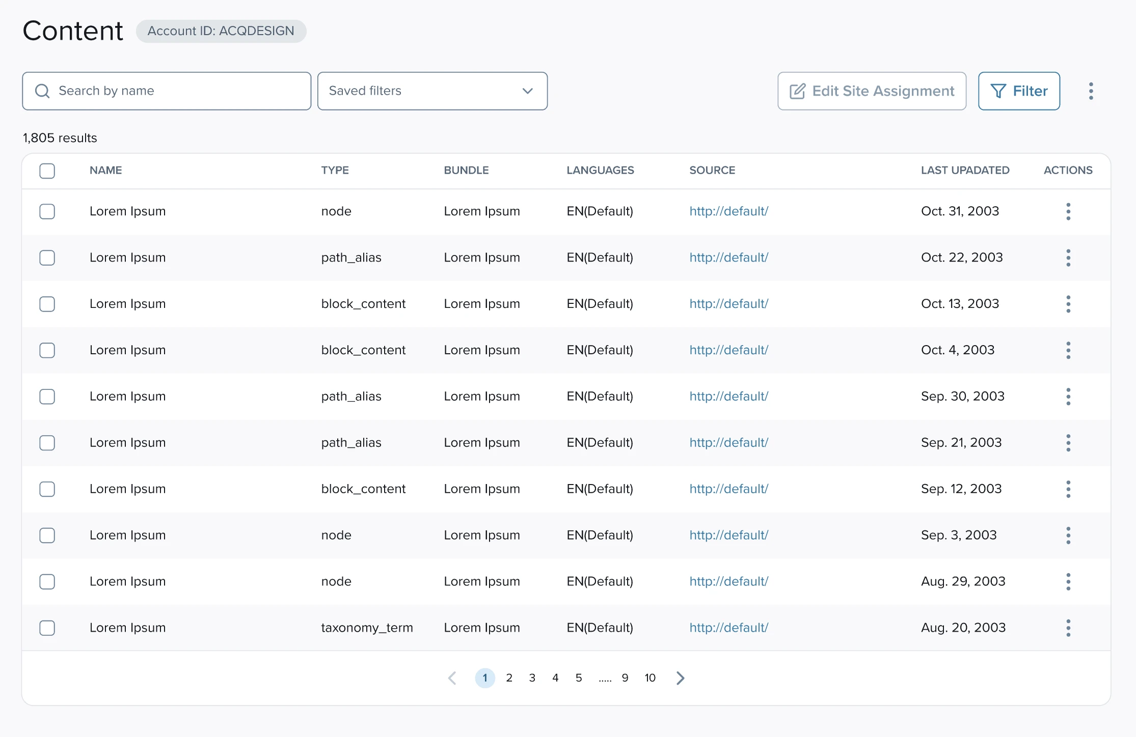
Default view
Simplified to all things related to filtering in the sidebar, accessible from the single button.
Made the Filter button primary, as that's the most common action from this view.
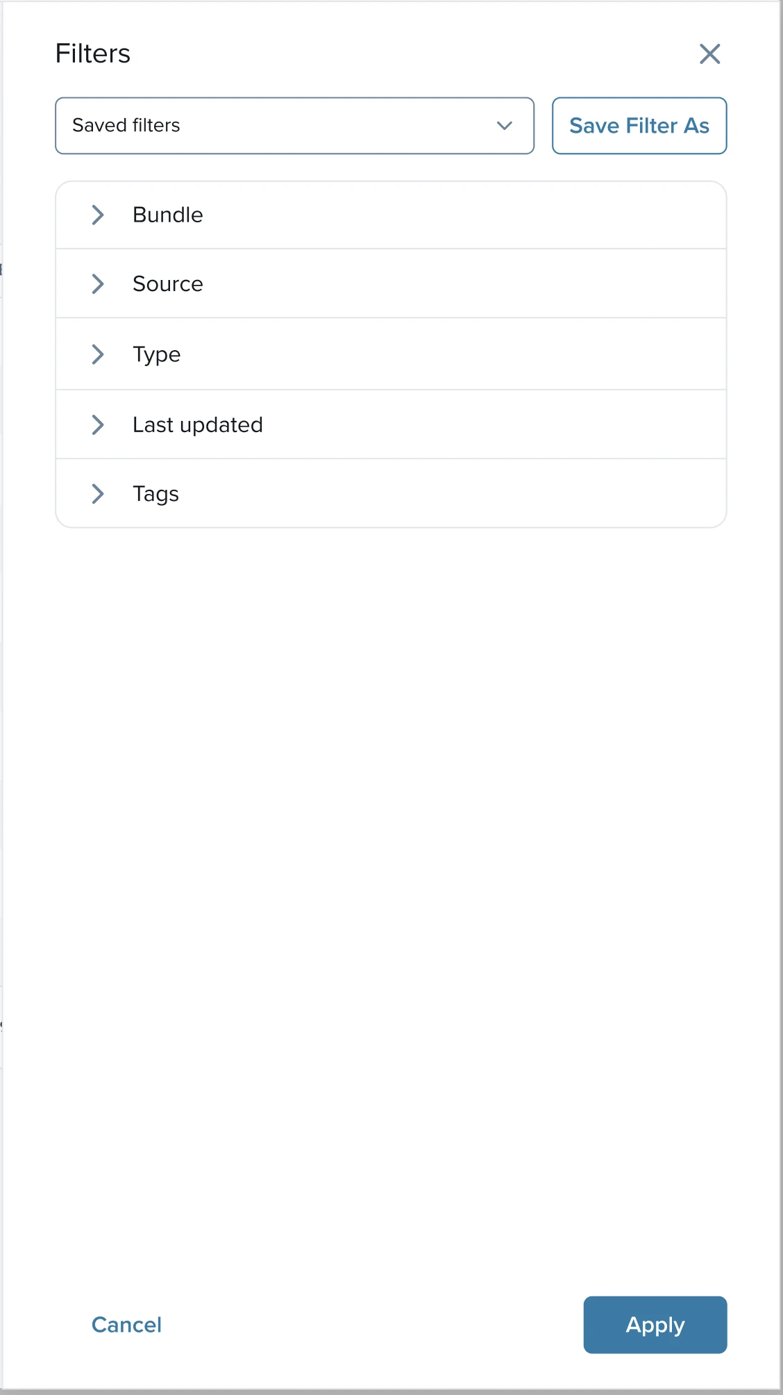
Unsaved filter applied
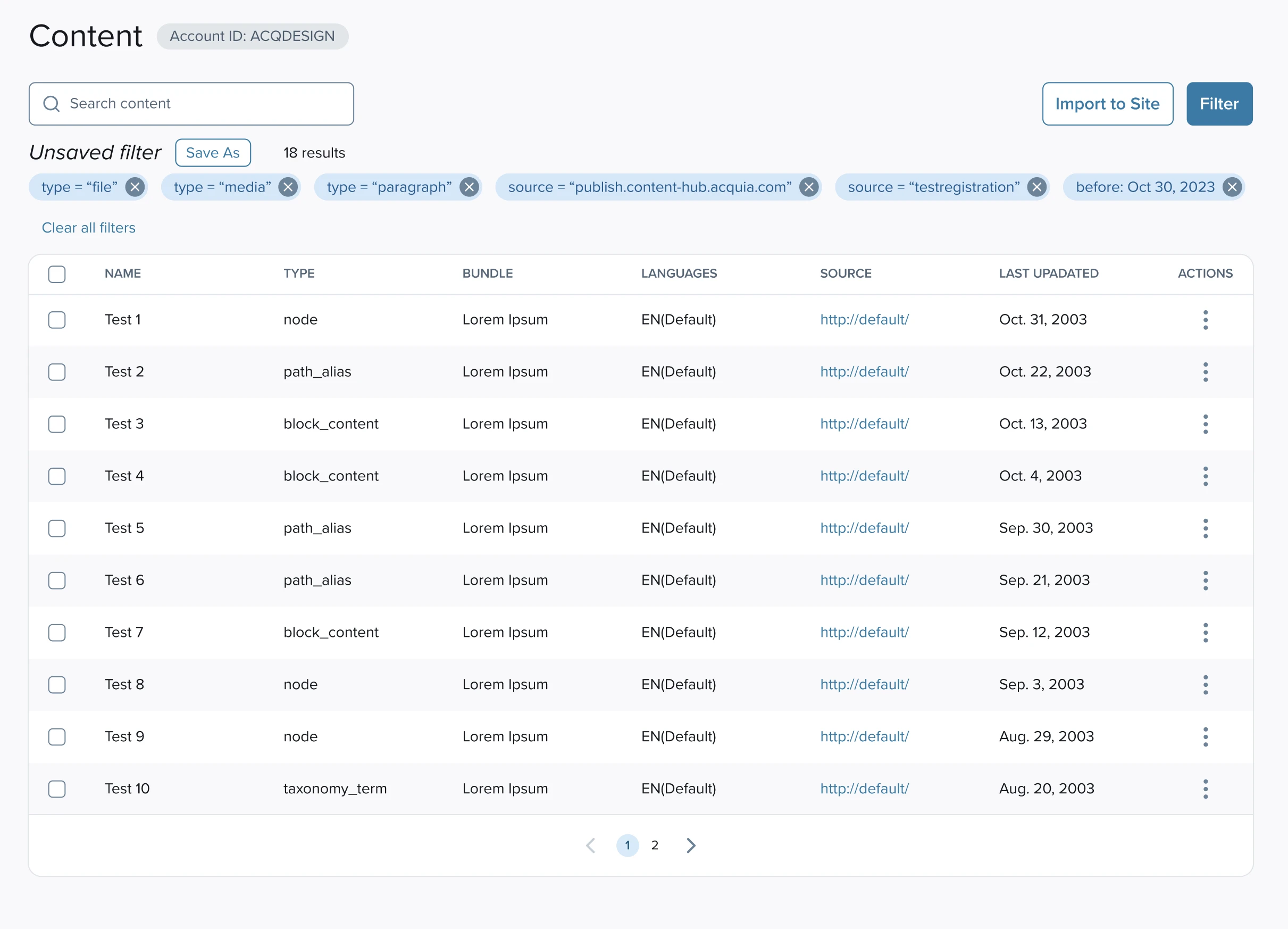
All filter values are displayed as consistent tags in one place.
Saving as a new filter can be done from this view.
Viewing saved filter values
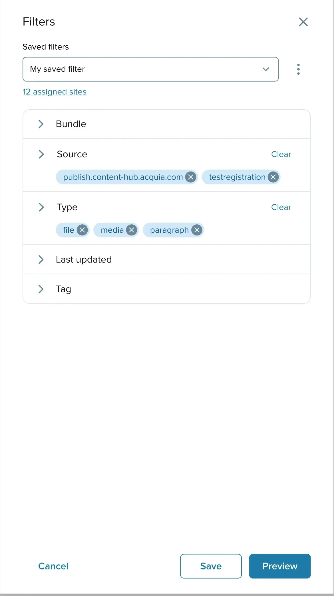
Permanent label on saved filters dropdown.
Overview of selected filter values.
Clear options to save or preview without saving.
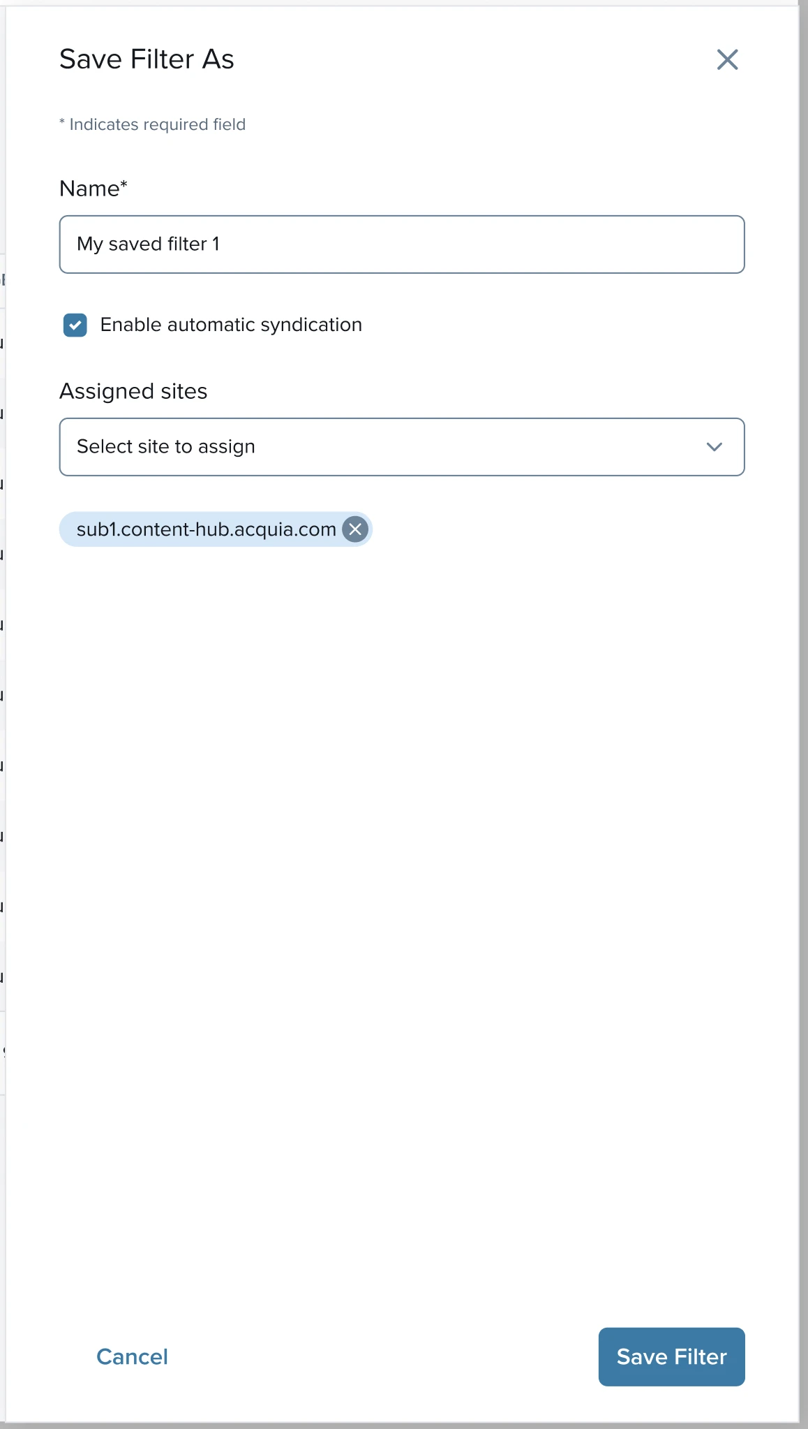
Editing name and assigned sites

More standard checkbox selection for assigned sites to scale with many sites.
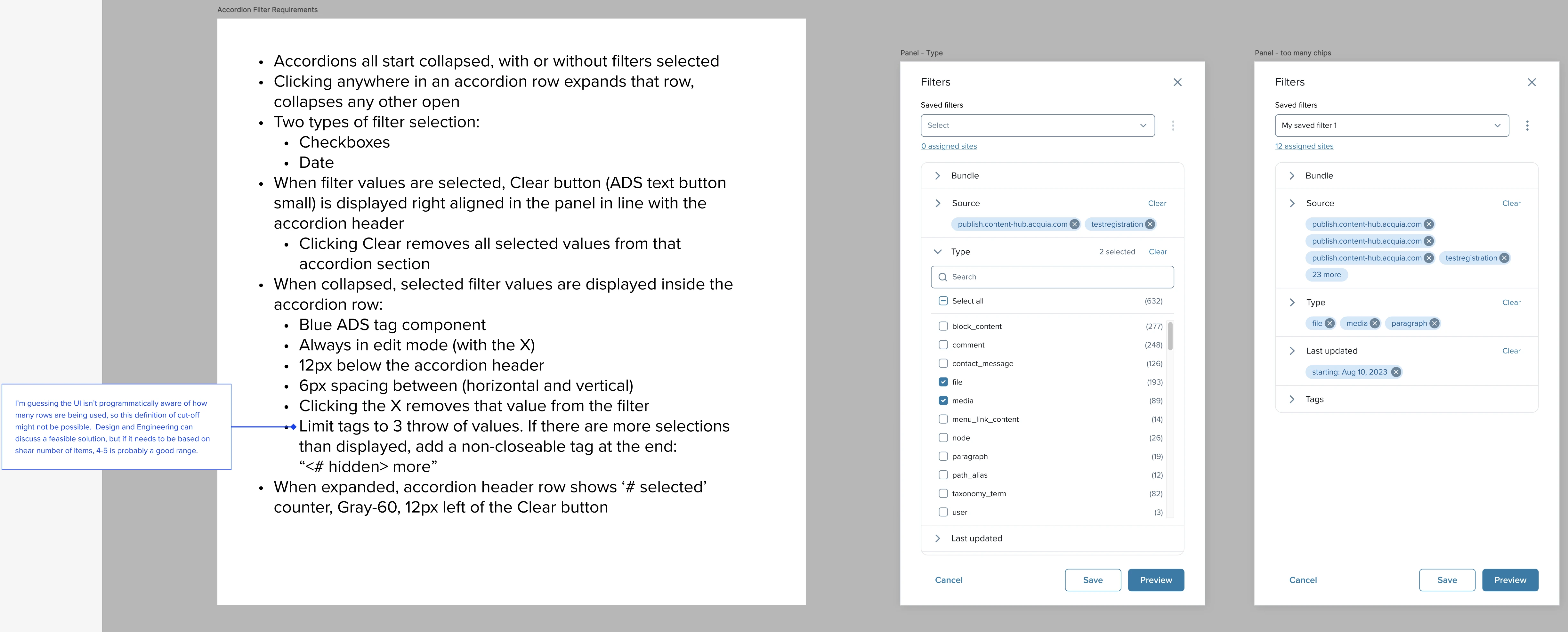
Documentation
Example of detailed documentation for engineers, including:
visual specs
behaviours/interactions
states
Click images to enlarge.
Default view
Selecting filter values

Filter applied

Ideal: qualitative data from users regarding their ability to use and satisfaction with the redesigned filtering feature
Alternatively: the percentage of users who execute and/or save filters
Fewer accessibility violations
Decrease in the amount of code that's not using shared components