Design system

Acquia currently maintains two distinct design systems:
Patterns is more mature, making use of more styles and variables and having a more robust structure.
ADS was workable, but somewhat weak. Structure was lacking, no variables in use, and numerous discrepancies between the Figma file and library used by engineers.
We don’t have any teams dedicated to the maintenance and governance of our design systems, so it falls on individual designers to take on various parts of the load.
The largest time spent was on components that had fallen out of alignment with those implemented in code. The code had been updated, but the Figma components hadn't received the corresponding updates. This was effectively creating new components from scratch to match what was implemented.
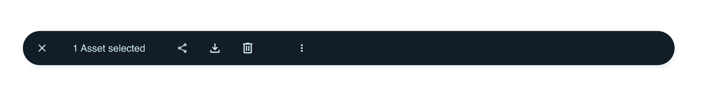
Batch action bar - Before

Batch action bar - After
Some components required some refactoring to improve their structure and responsiveness.
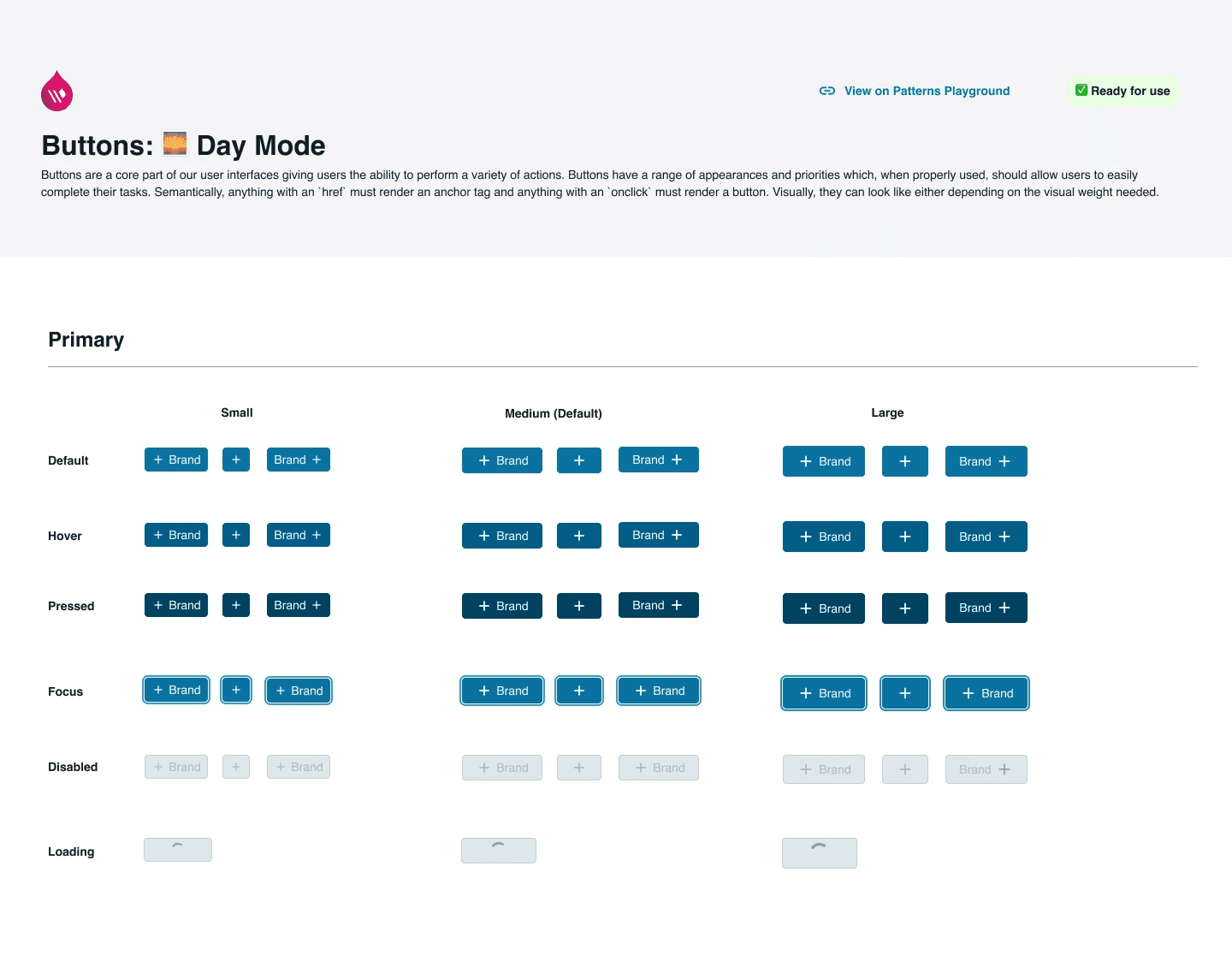
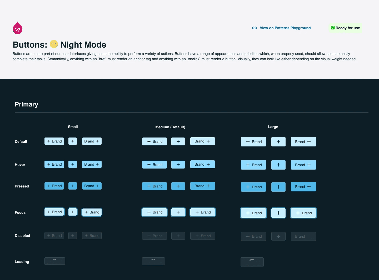
I added/updated colour variables in Figma to match 1:1 with the CSS variables in the code, then implemented them in components for more clear alignment and easier management in the future. This also allowed us to eliminate the need to separately create light and dark mode components since we can map colour schemes to modes.
Click image to enlarge.
Buttons - Light mode
Buttons - Dark mode
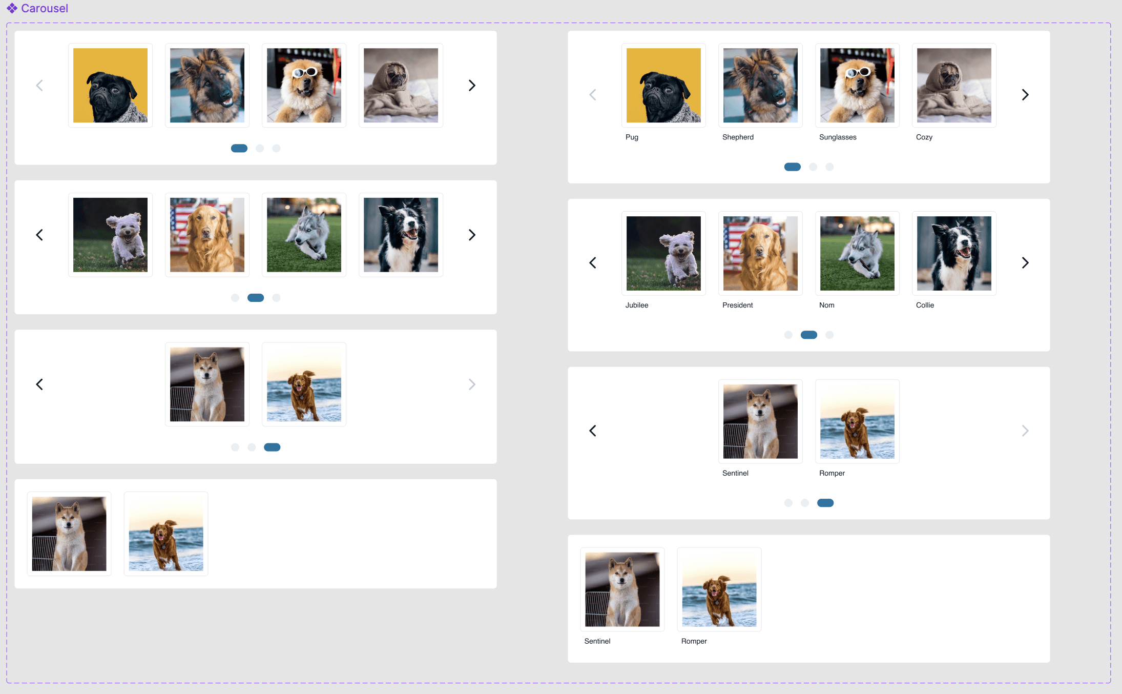
I created brand new components that were defined in the code but missing in Figma. This involved looking at the code documentation in the library and reverse engineering that into the Figma component to match that style and behaviour.
Click image to enlarge.
Carousel
Previously, all components in ADS were in separate frames within the same page. I restructured the file so that now each component has a dedicated page in the navigation, making it easy to scan.
Click image to enlarge.
Before

After

I also developed and shared a clear process for making new updates to the system.
Numerous components required maintenance, including:
Adding missing variants
Correcting colours
Restructuring
Removing old/unused
For each component, I created usage guidelines and accessibility details. This helps both designers and engineers understand when/how to use a component as well as how it should work in ways Figma prototyping can't capture.
Beyond working directly in Figma with the design systems, I've acted as an advocate for broader use of ADS.