Design system
Create one unified design system to replace two existing
Get up and running quickly with minimal engineering effort
Enable WCAG 2.2 AA accessibility conformance
Improve design + engineering efficiency
Lead the design efforts for:
components and variants
design tokens
documentation
Collaborate with design leadership for:
responsive page scaffolding
logistics across functional areas
Collaborate with engineering for:
managing the technical integration with code
Acquia inherited two design systems through acquisition:
One built in React
One built in Angular
This created inconsistent experiences and a maintenance burden. To unify the systems and meet accessibility goals without rebuilding from scratch, we purchased PrimeOne, a component library available in both frameworks.
Why: PrimeTek includes many more components and variants than we use.
Approach:
Audited both legacy systems to identify required components
Prioritized only what was in active use
Kept a few “nice-to-have” components if they supported existing patterns or improved UX
Result: Removed over 34% of the default components (and countless variants) to reduce clutter and confusion; archived for future use if needed.
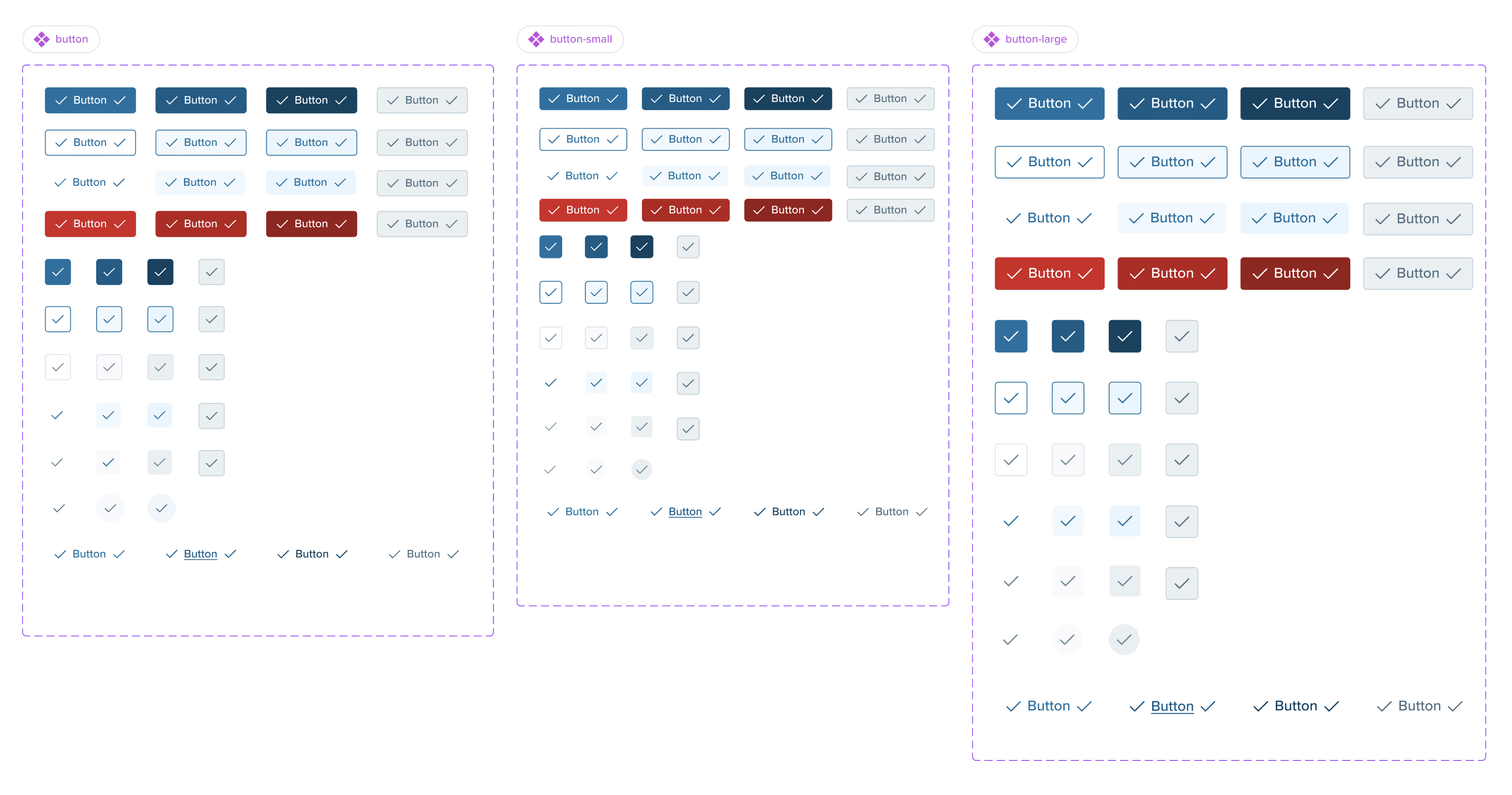
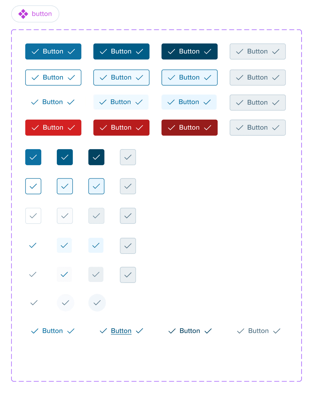
Kept vs. archived components

Drastic reduction in colors and styles of button variants (many of the original variants not shown here)
Before
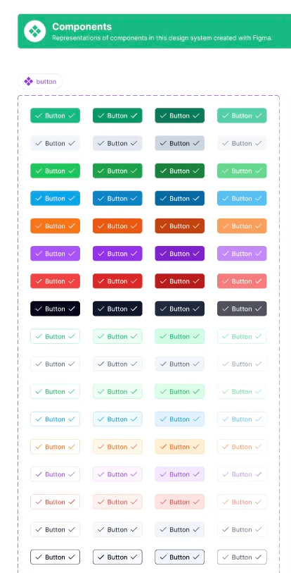
After
Why: Many of the default components didn't align with Acquia's current patterns.
Actions Taken:
Examine components across existing design systems
Restructure PrimeOne components
Result: Components that are familiar to users and designers of both systems.
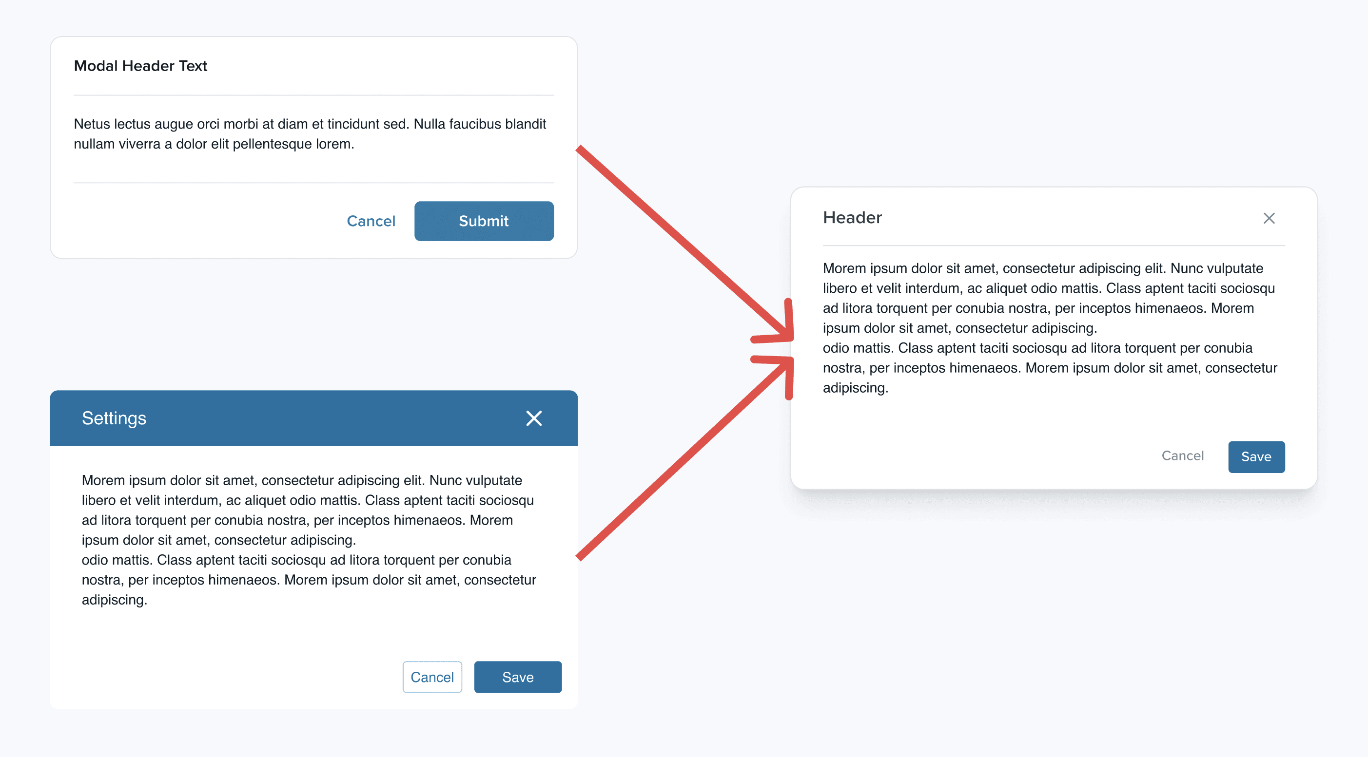
Fusion of two modal components into one
Why: Align component visuals with Acquia’s brand and WCAG AA standards
Actions Taken:
Used bundled token system from PrimeTek as a base
Updated brand colors, spacing, radii, and contrast
Introduced custom semantic tokens (e.g., {button.primary.background} → {primary.color} → {brand.600})
Tool: Tokens Studio for Figma
Challenge: Learning curve with token sets and plug-in behavior
Solution: Leaned on PrimeTek documentation and support; created a semantic token structure for long-term maintainability
Sample of custom design tokens added

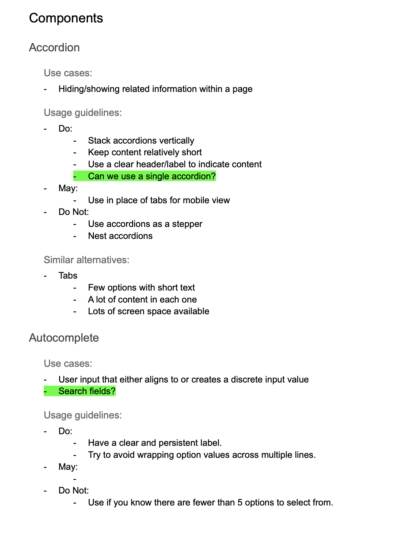
Throughout the project I’ve been documenting:
Design system decisions
Usage guidelines
Change tracking for modified components
Governance process for future requests or additions
This serves as both internal reference and a tool for onboarding designers to the system.
Samples of documentation for process and usage
Click images to enlarge.

Reality: Several new product UIs were being built while the design system was still under construction.
Benefits:
Real-time feedback from designers on component needs and layout constraints
Informed decisions on tokens, variants, and usage rules
Constraint:
To maintain low maintenance, avoided non-token-based component changes unless absolutely necessary
Balanced creating new components with adapting product designs to available tools
Collaboration Tools:
Recurring design system office hours
Figma comments and async discussions
Accessibility Push: Acquia had previously not supported 320px-wide viewports—a WCAG 2.2 AA requirement.
Actions:
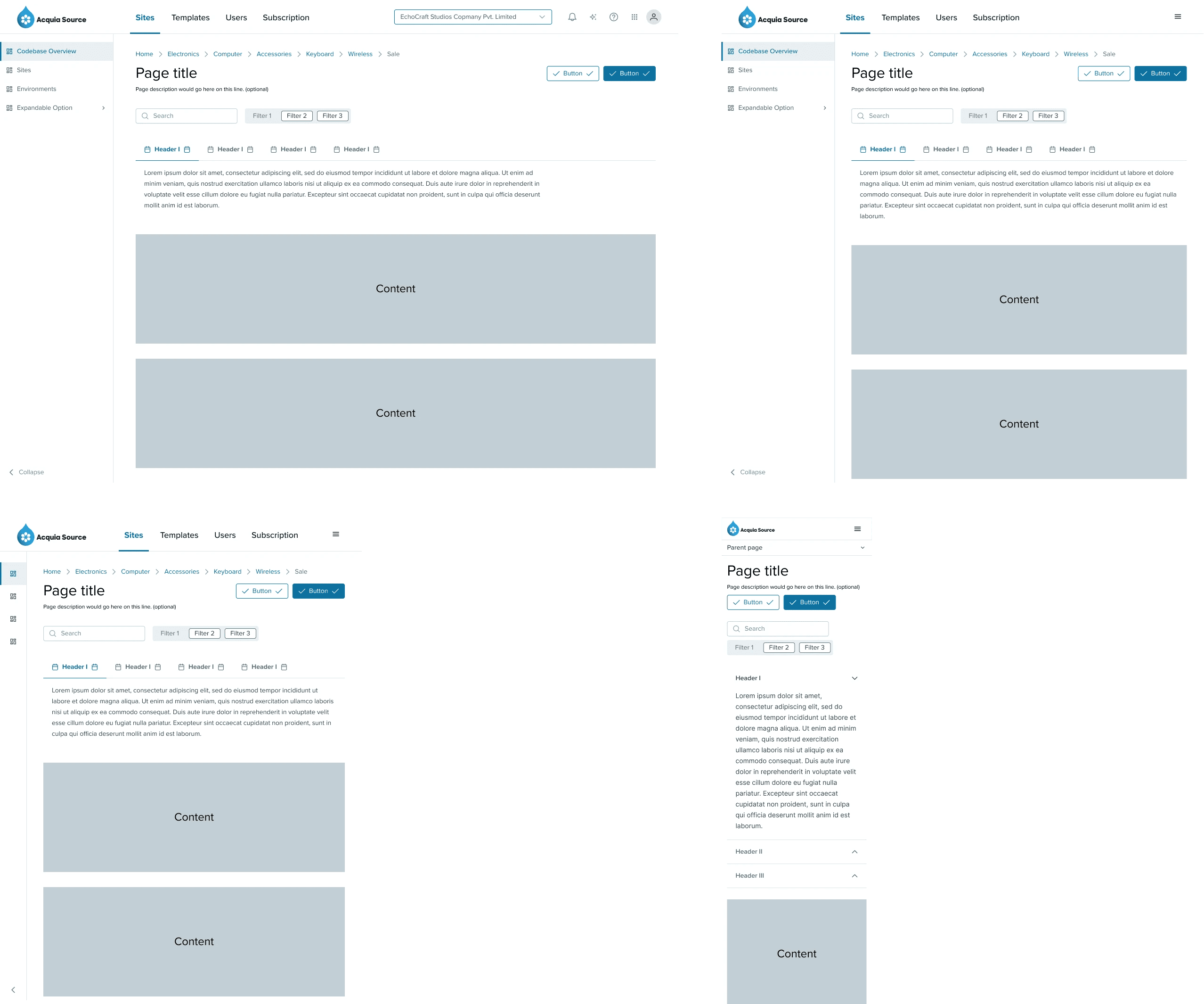
Introduced responsive layout scaffolding
Defined standard page templates designers can drop content into
Removed guesswork around spacing, alignment, and navigation patterns
Impact: Helped align teams on grid structure and visual hierarchy across products.
Various breakpoints for the scaffolding
Unified Figma component library
Centralized semantic token structure (synced to code via theme file)
Early visual consistency across new products
Improved accessibility + responsive layout support
Fewer off-brand design choices from newer designers
Define patterns for common functional areas (e.g. forms, filtering, search UI)
Continue documenting component-level guidance
Educate design team on working with a design system
Monitor adoption and gather feedback to refine components
Partner with engineering to match UI implementation to Figma specs